Money, Money, Money
Oh, Money! The root of our coffee filled workdays, and the reason why we stay up at night. Like most individuals, we worry how to accumulate it, how to manage it, and how to grow it; and if you are one of the lucky ones who has saved up and invested, there still comes a point in time where you’ll wonder about life after work:

All these questions stir within the mind, and that’s where Martello Investments comes in.
Martello Investments is a wealth management firm that manages portfolios of individuals and families with a focus on retirement, tax, estate, and investment planning. With a team of two dedicated professionals, they offer personalized services to clients, ensuring that each client's unique financial goals are addressed.
“How will I survive?”
“How can my kids experience fewer hardships than
I did?”
“How can I finally get the Ferrari I’ve wanted since I was a kid?”
Client
Martello Investments, LLC
Design Team
The Challenge
Sheridan Culver
Scott Kapelman
Rachel Poe
Nadia Di Trapani
Emma Walsh
Project Duration
June 2023 - July 2023 - 6 weeks
Tools
Figma
Figjam
Adobe Illustrator
Google Forms
Google Sheets
Designing Trust
Martello approached the team with one clear objective: Design a client onboarding system and an investment portfolio portal for PC & Mobile. They emphasized the ability to organize and share documents, without the use of a third party, while keeping the focus on ease of navigation and understanding. Most importantly, they wanted to foster trust by creating a transparent portfolio experience for the user.
Although this seemed like an easy peasy task at the time, difficulties would soon arise.
Most people invest and they
are confused by its complexity.
User Interviews
We kicked off the discovery phase by asking some key questions such as:
Why do people use wealth managers in the first place and how did their prior experiences with investing affect the way they approach it today?
We initially interviewed 10 people ages 28-66 with varying experience with investing to get a better insight.
“The challenge I originally faced was that investing was complicated and over my head. I didn’t have the time outside of work to learn it all so having a dedicated financial advisor take over, so I didn’t have to do any thinking, made it much easier.”
“Lack of knowledge, feels like it’s set up to be deceiving, I don’t want to do extensive research to know my money is working
for me.”
“We are currently unsure about what to do with money from the sale of a house and the financial advisor at the bank overwhelmed us with options.”
It was clear that users were confused by the varying degree of knowledge and time that was required in order to grasp the complexity of financial markets. As the great meme goes: “Ain’t nobody got time for that!”.
We continued to conduct more interviews to help gather user preferences for setting up accounts with financial institutions. Users shared a need for simplicity and ease of use.
“I need things to be simple and as basic as possible with staff ready to help when setting up.”
“The tools on my investment app weren’t easy to navigate right off the bat which made me hesitant with the company at first.”
“It should be expected that people are starting with
zero knowledge unless they have a business degree
or something.”
Most people who invest seek
professional support
User Survey
The qualitative research that our team conducted was insightful, but to help us understand if the sentiments shared by those we interviewed were representative within larger groups of people, we created an online survey.
We collected data from 44 responses.
Most respondents have worked with or currently work with a financial advisor or use an investment service.

Respondents expect personalized guidance from a financial advisor, step-by-step instructions, and interactive tools to help with investment decisions.

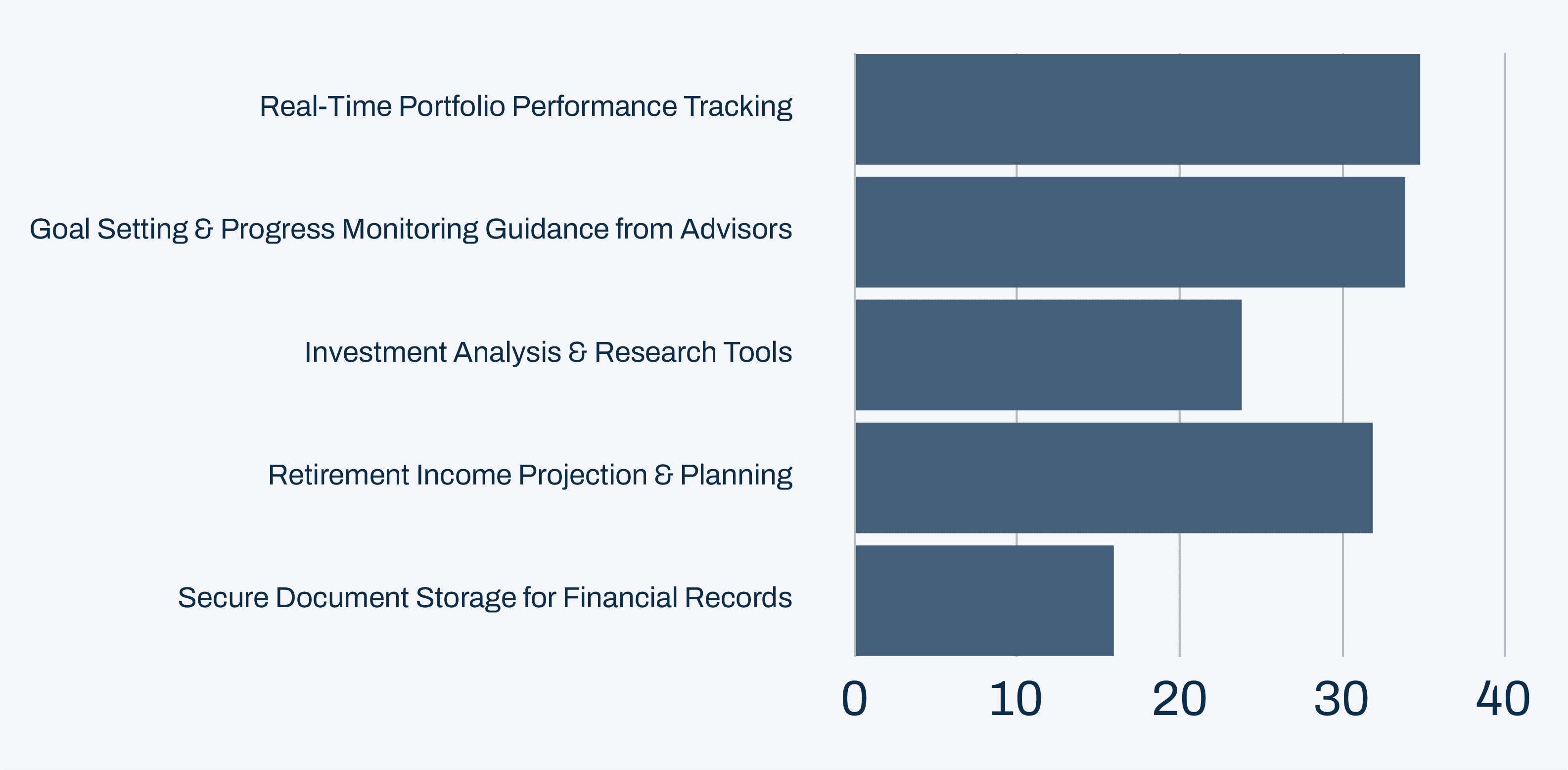
Respondents want real-time portfolio performance tracking, goal setting, progress monitoring, and retirement income planning & projection features.


The Adventurous Explorer
& Aspiring Retiree
No Pain, No Gain!
Current Onboarding Portal is
not intuitive.
Taking a look else where
Pain Points
Heuristic Evaluation
How Might We:
We synthesized our User Interview and Survey results with Martello’s target user to create The Adventurous Traveler & Aspiring Retiree. They are a 59-year-old accomplished professional with a successful career in marketing. They have been diligent in saving for retirement and are now eagerly looking forward to the next chapter of their life. While they have a basic understanding of investing, they prefer to rely on the expertise of a wealth management company to handle their investments, allowing them to focus on their passion for travel and exploration.
Age: 59
Occupation: Marketing Director
Tech Literacy: Moderate
Income Level: Moderate to High
Goals:
Streamlined Retirement Planning
Wants a client dashboard that simplifies the retirement planning process and provides a clear view of their investment and retirement information.
Trustworthy Wealth Management
Seeks support from a trusted partnership with a wealth management company that understands their needs and provides sound investment advice.Personalized Portfolio Viewing
Desires a client dashboard with real-time data and analytics tailored to their investment preferences and travel-related financial goals.Seamless Onboarding Experience
Expects a user-friendly onboarding process without complex procedures.
Frustrations:
Retirement Income Optimization
Feels unsure about how to effectively manage and optimize their retirement savings to sustain their desired lifestyle.Complex Financial Jargon
Finds financial terminology and jargon complex and daunting, making it difficult to grasp investment concepts and strategies with confidence.Importance of Authentic Interactions
Values meaningful conversations with wealth managers but becomes skeptical if conversations feel like
sales pitches.
The frustrations that our Persona faced was a constant theme that was present throughout the entire discovery and define phase. Although users are overwhelmed by investing, and require/ seek the help of advisors, they still want a sense of control in order to feel they are on the path to achieving financial freedom. Their main pain points were:
Investing Feels Intimidating & Inaccessible: Investment knowledge and strategies often feel out of reach due to overwhelming complexity and limited access to investment knowledge especially when trying to navigate wealth management site menus with too many options and
financial jargon.
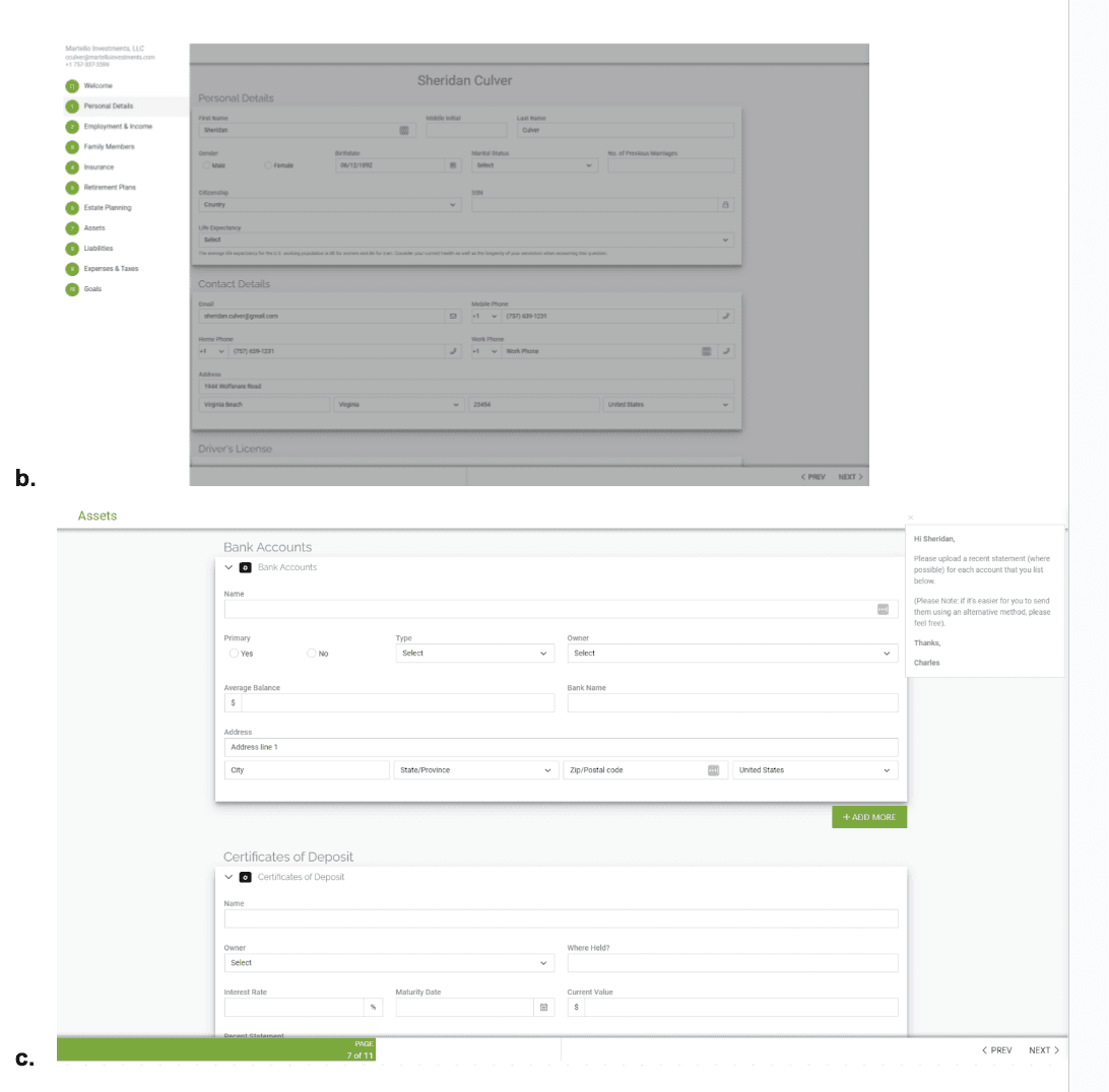
The Onboarding Process for wealth managers is
too complex: When setting up an investment account users found the process to be time-consuming and frustrating often requiring multiple forms, document submissions, and verification steps.
They Need Easy Access to Support: Users need the flexibility to connect with their wealth manager through their preferred communication method. Balancing client preferences with the business needs to manage time, especially for smaller teams, is essential for providing quality service.
The difficulty was in trying to filter these abstract financial terms that populated account set-up pages and portals into an accessible and simplified setup process that ultimately took our user to an user-friendly and intuitive interface.
Create an intuitive and user-friendly investment dashboard?
Help facilitate the ease of communication and information exchange to optimize convenience for both the client
and advisor?
Make filling out forms, uploading documents, and other information exchanges painless for the client especially during the onboarding process?
Streamlined Onboarding, Intuitive Information Flow, Organized Document Management, and Adaptive Support with Martello Investments
Since no one on the team was punished with a Goldman Sachs summer internship, we had to take the time to educate ourselves on industry standards within the wealth management landscape. We started with a deep analysis of what Martello was currently doing to attract prospective clients- my oh my was there a lot to fix!
Martello Current Onboarding Pain Points:
Client Support
Options for support (email/phone number) are hidden in side navigation bar and not clearly labeled. Pop ups with additional instructions, explanations, or information are vague.
Side Navigation Bar
The side navigation bar is only visible when clicked on making it hard for clients to understand where they are in the onboarding process.
Next & Back Navigation
Next & back navigation at the bottom right hand side of the page are small and are the only way to navigate through onboarding as the side navigation bar is not clickable.
Progress Bar
Progress bar is low on the page, confusing and conflicts with visual hierarchy.
Saving
As clients fill out the form, there is no indication of whether their work is saved or not.
3rd Party Portal
This portal is a tool created by a 3rd party which could make some clients wary when having to input.
Client Support
Side Navigation Bar
Next & Back Navigation
Progress Bar
Saving
Onboarding Comparative Analysis
Dashboard Comparative Analysis
Solution
Although investors we interviewed shared some general details about the onboarding process when creating an online account, most could not remember specifics nor did they have access to the onboarding portal. We looked at other types of businesses that require onboarding/input of information on desktop and mobile. Ex. job search tool, tax tool, online dating app.
Teal
Task bar at top of page showing percentage completed
Check marks to indicate what tasks you’ve completed

TurboTax
Intuitive side bar navigation makes it clear where you are.
Search & Help options in upper righthand corner
Clickable links to Learn more available to help with client understanding.

Badoo
Easy to navigate back an forth through onboarding via arrows
Pages and verbiage are simple without UI clutter
We then reviewed the dashboard content of several well-known investment companies to gain further insight in how they laid out information. (include overall takeaway, key visuals, important tools, navigation, difference someone working with an advisor vs. not)

Dashboard content often included:
Performance Summary
List of Accounts
Insight Links
Dashboard visuals included graphs, lists, and information icons.
Dashboard navigation consists of a main navigation and several sub navigation bars and drop down menus.


To build trust with prospective clients, Martello must follow industry standards with the focus in implementing step-by-step navigation during the onboarding process, providing flexible support options, and streamlining the site's information architecture using plain language as well as integrating tools for users to monitor their investments.

Creating streamlined dashboard
site navigation
Site Architecture
Defining the site architecture was a crucial part of the process. We needed to organize the portal in an intuitive way regardless of one’s experience with investing while showcasing the specific services that Martello offered.
We took into consideration the lengthy navigation options found on other investment platforms and distilled that information down to the most essential content using plain language as much as possible.
PC Site
INSURANCE
ESTATE PLANNING
FINANCIALS
PROFILE
HOME
Summary
Accounts
Activity
Will
Power of Attorney
Advance Care Directives
Home
Car
Life
Disability
Long Term Care
Income
Assets
Liabilities
Expenses
Taxes
Basic Info
Goals
Family
Outside Professionals
Mobile Site
SEARCH
SETTINGS
CONTACT
PROFILE
HOME
Summary
Accounts
Activity
Basic Info
Goals
Family
Outside Professionals
Financials
Insurance
Estate Planning
Building with a mobile first mindset
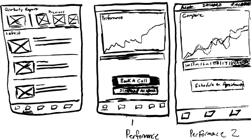
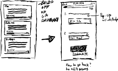
Sketches
Our team began to sketch & ideate with a mobile first mindset. This allowed us to hone in on the essential features that users expected to see when interacting with a wealth management platform. From asset allocation charts to up-to date news articles regarding investments, these preliminary drawings allowed us to explore design possibilities while addressing both client and target user needs.
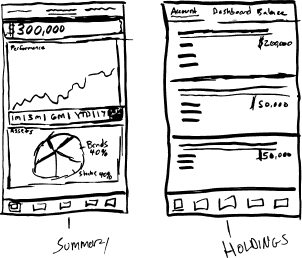


Mobile Dashboard
Mobile Onboarding
PC Dashboard


A/B testing with chart visuals to see what resonates most with users.
Facilitate usability testing with our PC prototype to uncover any user pain points as we did for mobile.
Work with developer to build out portal and test with actual real life users and support through soft-launch.
Develop advisor portal to view client information
Creating a simplified platform
with support options.

Building Trust with
Transparent Financial Planning
Testing! Testing!
Usability Testing
After working through wireframes, we built our high-fidelty prototype. To validate our design decisions we conducted usability testing on our mobile prototype to uncover any areas of confusion.

Can I scroll?
When asked to perform tasks on the Dashboard and Document screens, users were not aware they could scroll down the page due to lack of a visual affordance.
Where are my documents?
When toggling to the Documents page, users expressed that they expected the list of documents to be above the upload and take photo icons rather than having to scroll to see the list.

What’s with all the buttons?
Users were confused by having a Next Page button and a Next navigation link at the top of the page. All users chose to press the Next Page button over the other option saying that it looks more official.
Additionally, users also expressed that they expected the Save button to be near the Next Page button at the bottom of the page especially so they don’t forget to save their work before moving on.

Secure Information Organization, Storage, and Exchange
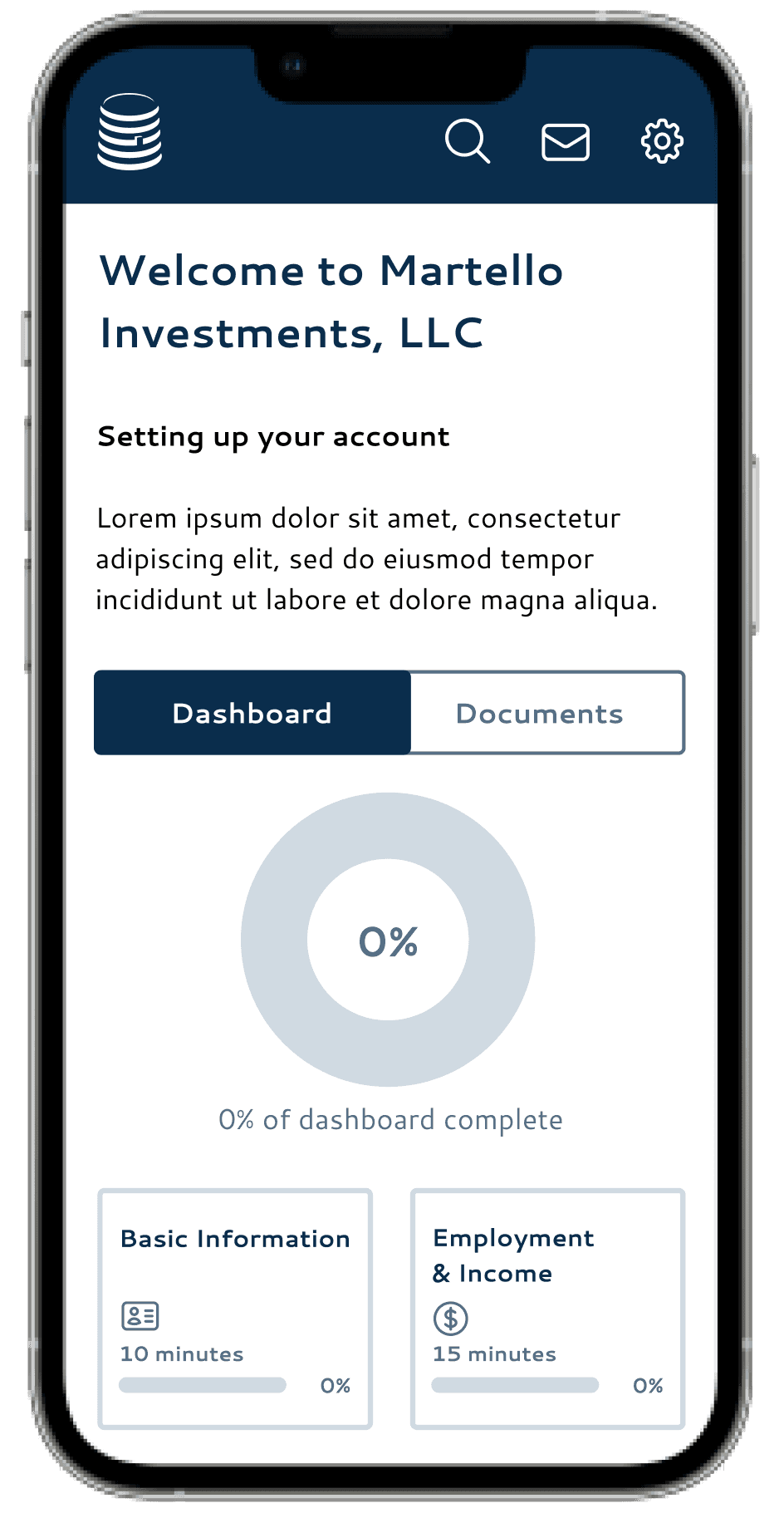
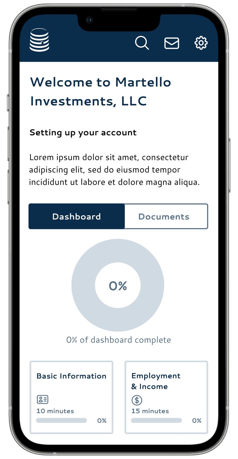
Onboarding Hi-fi Prototype
Dashboard Hi-fi Prototype
With a focus on user needs, our team crafted a user-friendly onboarding system that emphasizes the importance of streamlining the process while safeguarding data privacy.
This interface allows users to seamlessly onboard onto the platform, eliminating the need for intermediaries and ensuring exclusive access to confidential information for their
trusted advisors.
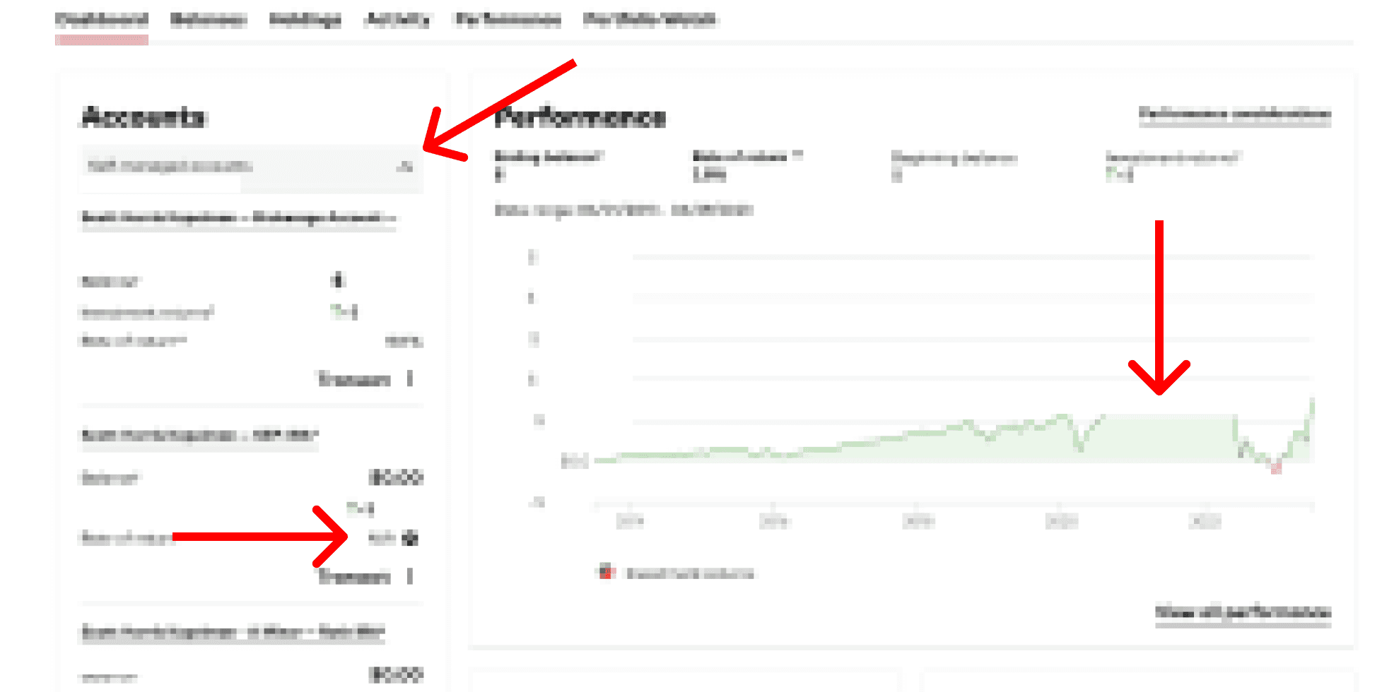
With our newfound understanding of the complexities and challenges users encounter in financial management, our team crafted an intuitive interface that presents users with a concise yet comprehensive overview of their financial status in real-time.
By consolidating financial information in one secure location, the portal empowers users with effortless organization, storage, and sharing capabilities. The outcome is a simple onboarding system that directly connects users with their advisors, simplifying financial interactions and fostering seamless communication.
By leveraging interactive data visualizations, personalized dashboards, and simplified language, we ensured that users could effortlessly grasp and interpret their financial data. The result is a financial portal that empowers users with the knowledge and confidence to make informed decisions about their financial goals.


Real-Time Simplified Financial Summary
A/B testing with chart visuals to see what resonates most with users.
Facilitate usability testing with our PC prototype to uncover any user pain points as we did for mobile.
Work with developer to build out portal and test with actual real life users and support through soft-launch.
Develop advisor portal to view client information
Support Hi-fi Prototype
Next Steps
Users emphasized the importance of prioritizing support options. Our team developed an intuitive and user-friendly interface that ensures seamless access to critical
support features.
Prioritized Intuitive Support for Users
The Future of Martello’s Client Portal


Contact
Schedule a phone call
Schedule an in person appointment
Schedule a phone call
Schedule an in person appointment
Charles Culver, CFP
Arthur Grizzle, CFA, MBA
With the inclusion of dedicated email support and highly accessible scheduling options, maintaining direct contact is easy and efficient.


Oh! I see you’ve selected this case study.
At the moment I'm still working on this one, but check back soon to see the final thing!
Streamlined Onboarding, Intuitive Information Flow, Organized Document Management, and Adaptive Support with Martello Investments

Building Trust with
Transparent Financial Planning
Money, Money, Money
Oh, Money! The root of our coffee filled workdays, and the reason why we stay up at night. Like most individuals, we worry how to accumulate it, how to manage it, and how to grow it; and if you are one of the lucky ones who has saved up and invested, there still comes a point in time where you’ll wonder about life after work:

All these questions stir within the mind, and that’s where Martello Investments comes in.
Martello Investments is a wealth management firm that manages portfolios of individuals and families with a focus
on retirement, tax, estate, and investment planning. With a team of two dedicated professionals, they offer personalized services to clients, ensuring that
each client's unique financial goals
are addressed.
“How will I survive?”
“How can my kids experience fewer hardships than I did?”
“How can I finally get the Ferrari I’ve wanted since I was a kid?”
Martello Website
Designing Trust
Client
Martello Investments, LLC
Design Team
The Challenge
Sheridan Culver
Scott Kapelman
Rachel Poe
Nadia Di Trapani
Emma Walsh
Project Duration
June 2023 - July 2023 - 6 weeks
Tools
Figma
Figjam
Adobe Illustrator
Google Forms
Google Sheets
Martello approached the team with one clear objective: Design a client onboarding system and an investment portfolio portal for PC & Mobile. They emphasized the ability to organize and share documents, without the use of a third party, while keeping the focus on ease of navigation and understanding. Most importantly, they wanted to foster trust by creating a transparent portfolio experience for the user.
Although this seemed like an easy peasy task at the time, difficulties would soon arise.
Most people invest and they
are confused by its complexity.
User Interviews
We kicked off the discovery phase by asking some key questions such as:
Why do people use wealth managers in the first place and how did their prior experiences with investing affect the way they approach it today?
We initially interviewed 10 people ages 28-66 with varying experience with investing to get a better insight.
“The challenge I originally faced was that investing was complicated and over
my head. I didn’t have the time outside
of work to learn it all so having a dedicated financial advisor take over, so I didn’t have to do any thinking, made it much easier.”
“Lack of knowledge, feels like it’s set up to be deceiving, I don’t want to do extensive research to know my money is working for me.”
“We are currently unsure about what to do with money from the sale of a house and the financial advisor at the bank overwhelmed us with options.”
It was clear that users were confused by the varying degree of knowledge and time that was required in order to grasp the complexity of financial markets. As the great meme goes: “Ain’t nobody got time for that!”.
We continued to conduct more interviews to help gather user preferences for setting up accounts with financial institutions. Users shared a need for simplicity and ease of use.
“I need things to be simple and as basic as possible with staff ready to help when setting up.”
“The tools on my investment app weren’t easy to navigate right off the bat which made me hesitant with the company
at first.”
“It should be expected that people are starting with zero knowledge unless they have a business degree or something.”
User Survey
The qualitative research that our team conducted was insightful, but to help us understand if the sentiments shared by those we interviewed were representative within larger groups of people, we created an online survey.
We collected data from 44 responses.
Most respondents have worked with or currently work with a financial advisor or use an investment service.
Respondents expect personalized guidance from a financial advisor, step-by-step instructions, and interactive tools to help with investment decisions.
Respondents want real-time portfolio performance tracking, goal setting, progress monitoring, and retirement income planning & projection features.
The Adventurous Explorer
& Aspiring Retiree
We synthesized our User Interview and Survey results with Martello’s target user to create The Adventurous Traveler & Aspiring Retiree. They are a 59-year-old accomplished professional with a successful career in marketing. They have been diligent in saving for retirement and are now eagerly looking forward to the next chapter of their life. While they have a basic understanding of investing, they prefer to rely on the expertise of a wealth management company to handle their investments, allowing them to focus on their passion for travel and exploration.
Age: 59
Occupation: Marketing Director
Goals:
Streamlined Retirement Planning
Wants a client dashboard that simplifies the retirement planning process and provides a clear view of their investment and retirement information.
Trustworthy Wealth Management
Seeks support from a trusted partnership with a wealth management company that understands their needs and provides sound investment advice.
Personalized Portfolio Viewing
Desires a client dashboard with real-time data and analytics tailored to their investment preferences and travel-related financial goals.
Seamless Onboarding Experience
Expects a user-friendly onboarding process without complex procedures.
Frustrations:
Retirement Income Optimization
Feels unsure about how to effectively manage and optimize their retirement savings to sustain their desired lifestyle.
Complex Financial Jargon
Finds financial terminology and jargon complex and daunting, making it difficult to grasp investment concepts and strategies with confidence.
Importance of Authentic Interactions
Values meaningful conversations with wealth managers but becomes skeptical if conversations feel like sales pitches.
No Pain, No Gain!
Pain Points
The frustrations that our Persona faced was a constant theme that was present throughout the entire discovery and define phase. Although users are overwhelmed by investing, and require/ seek the help of advisors, they still want a sense of control in order to feel they are on the path to achieving financial freedom. Their main pain points were:
Investing Feels Intimidating & Inaccessible: Investment knowledge and strategies often feel out of reach due to overwhelming complexity and limited access to investment knowledge especially when trying to navigate wealth management site menus with too many options and financial jargon.
The Onboarding Process for wealth managers is too complex: When setting up an investment account users found the process to be time-consuming and frustrating often requiring multiple forms, document submissions, and verification steps.
They Need Easy Access to Support: Users need the flexibility to connect with their wealth manager through their preferred communication method. Balancing client preferences with the business needs to manage time, especially for smaller teams, is essential for providing quality service.
The difficulty was in trying to filter these abstract financial terms that populated account set-up pages and portals into an accessible and simplified setup process that ultimately took our user to an user-friendly and intuitive interface.
How Might We:
Create an intuitive and user-friendly investment dashboard?
Help facilitate the ease of communication and information exchange to optimize convenience for both the client
and advisor?
Make filling out forms, uploading documents, and other information exchanges painless for the client especially during the onboarding process?
Heuristic Evaluation
Since no one on the team was punished with a Goldman Sachs summer internship, we had to take the time to educate ourselves on industry standards within the wealth management landscape. We started with a deep analysis of what Martello was currently doing to attract prospective clients - my oh my was there a lot to fix!
Martello Current Onboarding Pain Points:
Client Support
Options for support (email/phone number) are hidden in side navigation bar and not clearly labeled. Pop ups with additional instructions, explanations, or information are vague.
Side Navigation Bar
The side navigation bar is only visible when clicked on making it hard for clients to understand where they are in the onboarding process.
Next & Back Navigation
Next & back navigation at the bottom right hand side of the page are small and are the only way to navigate through onboarding as the side navigation bar is not clickable.
Progress Bar
Progress bar is low on the page, confusing and conflicts with visual hierarchy.
Next & Back Navigation
Saving
As clients fill out the form, there is no indication of whether their work is saved or not.
3rd Party Portal
This portal is a tool created by a 3rd party which could make some clients wary when having to input.
Saving
Client Support
Side Navigation Bar
Dashboard content often included:
Performance Summary
List of Accounts
Insight Links
Solution
To build trust with prospective clients, Martello must follow industry standards with the focus in implementing step-by-step navigation during the onboarding process, providing flexible support options, and streamlining the site's information architecture using plain language as well as integrating tools for users to monitor their investments.
Creating streamlined dashboard site navigation
Site Architecture
Defining the site architecture was a crucial part of the process. We needed to organize the portal in an intuitive way regardless of one’s experience with investing while showcasing the specific services that Martello offered.
We took into consideration the lengthy navigation options found on other investment platforms and distilled that information down to the most essential content using plain language as much as possible.
PC Site
INSURANCE
ESTATE PLANNING
FINANCIALS
PROFILE
HOME
Summary
Accounts
Activity
Will
Power of Attorney
Advance Care Directives
Home
Car
Life
Disability
Long Term Care
Income
Assets
Liabilities
Expenses
Taxes
Basic Info
Goals
Family
Outside Professionals
Mobile Site
SEARCH
SETTINGS
CONTACT
PROFILE
HOME
Summary
Accounts
Activity
Basic Info
Goals
Family
Outside Professionals
Financials
Insurance
Estate Planning
Building with a mobile first mindset
Sketches
Our team began to sketch & ideate with a mobile first mindset. This allowed us to hone in on the essential features that users expected to see when interacting with a wealth management platform. From asset allocation charts to up-to date news articles regarding investments, these preliminary drawings allowed us to explore design possibilities while addressing both client and target user needs.


Mobile Dashboard
Mobile Onboarding
PC Dashboard

Testing! Testing!
Usability Testing
After working through wireframes, we built our high-fidelty prototype. To validate our design decisions we conducted usability testing on our mobile prototype to uncover any areas of confusion.
Can I scroll?
When asked to perform tasks on the Dashboard and Document screens, users were not aware they could scroll down the page due to lack of a visual affordance.
Where are my documents?
When toggling to the Documents page, users expressed that they expected the list of documents to be above the upload and take photo icons rather than having to scroll to see the list.
What’s with all the buttons?
Users were confused by having a Next Page button and a Next navigation link at the top of the page. All users chose to press the Next Page button over the other option saying that it looks more official.
Additionally, users also expressed that they expected the Save button to be near the Next Page button at the bottom of the page especially so they don’t forget to save their work before moving on.
Secure Information Organization, Storage,
and Exchange
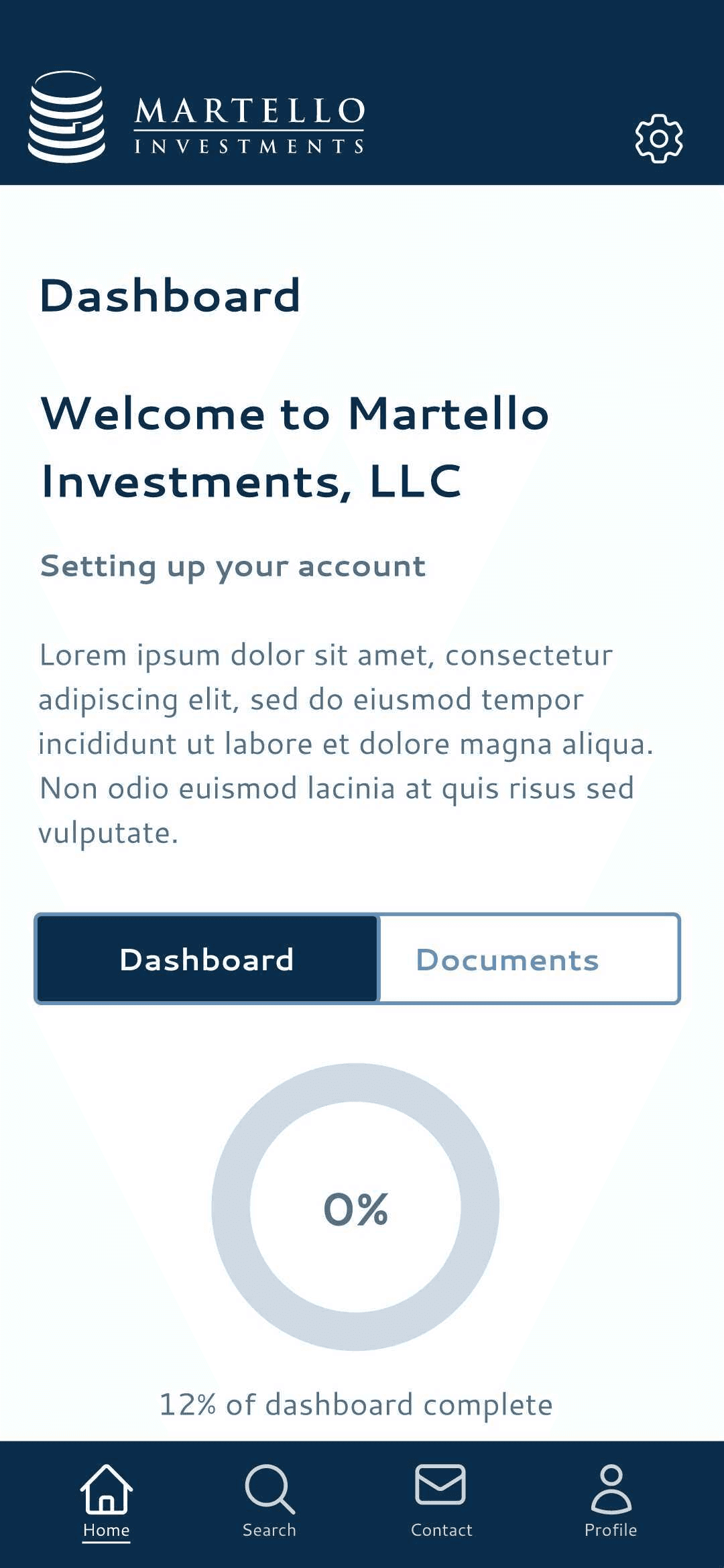
Onboarding Hi-fi Prototype
With a focus on user needs, our team crafted a user-friendly onboarding system that emphasizes the importance of streamlining the process while safeguarding data privacy.
This interface allows users to seamlessly onboard onto the platform, eliminating the need for intermediaries and ensuring exclusive access to confidential information for their trusted advisors.
By consolidating financial information in one secure location, the portal empowers users with effortless organization, storage, and sharing capabilities. The outcome is a simple onboarding system that directly connects users with their advisors, simplifying financial interactions and fostering seamless communication.


Dashboard Hi-fi Prototype
Support Hi-fi Prototype
With our newfound understanding of the complexities and challenges users encounter in financial management, our team crafted an intuitive interface that presents users with a concise yet comprehensive overview of their financial status in real-time.
Users emphasized the importance of prioritizing support options. Our team developed an intuitive and user-friendly interface that ensures seamless access to critical support features.
By leveraging interactive data visualizations, personalized dashboards, and simplified language, we ensured that users could effortlessly grasp and interpret their financial data. The result is a financial portal that empowers users with the knowledge and confidence to make informed decisions about their financial goals.
Real-Time Simplified Financial Summary
Prioritized Intuitive Support for Users

With the inclusion of dedicated email support and highly accessible scheduling options, maintaining direct contact is easy and efficient.

Most people who invest seek
professional support
Tech Literacy: Moderate
Income Level: Moderate to High
Current Onboarding Portal is
not intuitive.
Progress Bar
Creating a simplified platform
with support options.
Taking a look else where
Onboarding Comparative Analysis
Although investors we interviewed shared some general details about the onboarding process when creating an online account, most could not remember specifics nor did they have access to the onboarding portal. We looked at other types of businesses that require onboarding/input of information on desktop and mobile. Ex. job search tool, tax tool, online dating app.
TurboTax
Intuitive side bar navigation makes it clear where you are.
Search & Help options in upper righthand corner
Clickable links to Learn more available to help with client understanding.
Teal
Task bar at top of page showing percentage completed
Check marks to indicate what tasks you’ve completed
Badoo
Easy to navigate back an forth through onboarding via arrows
Pages and verbiage are simple without UI clutter
Dashboard Comparative Analysis
We then reviewed the dashboard content of several well-known investment companies to gain further insight in how they laid out information. (include overall takeaway, key visuals, important tools, navigation, difference someone working with an advisor vs. not)
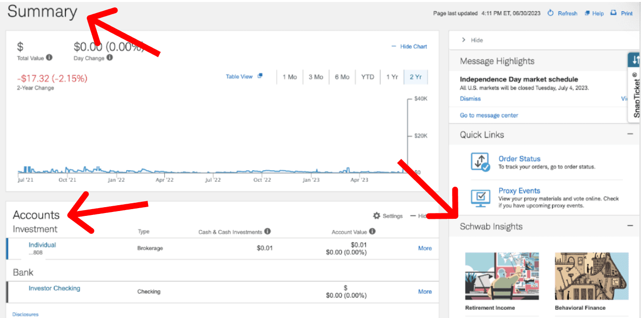
Dashboard visuals included graphs, lists, and information icons.

Dashboard navigation consists of a main navigation and several sub navigation bars and drop down menus.

Next Steps
A/B testing with chart visuals to see what resonates most with users.
Facilitate usability testing with our PC prototype to uncover any user pain points as we did for mobile.
Work with developer to build out portal and test with actual real life users and support through soft-launch.
Develop advisor portal to view client information
The Future of Martello’s Client Portal